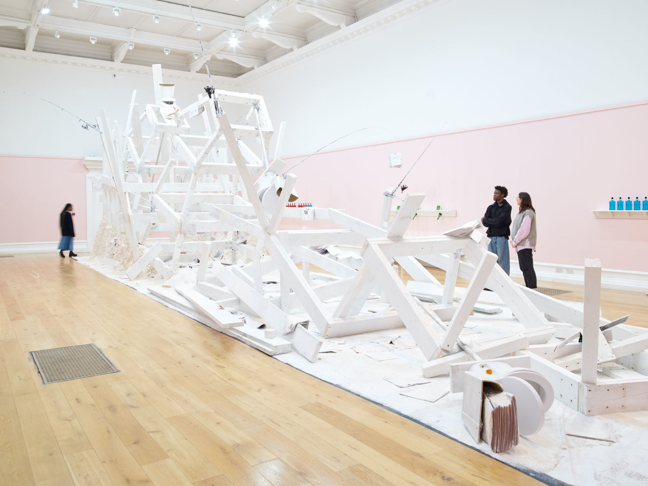
Pope.L: Hospital, South London Gallery, 2023. Photo: Andy Stagg. Courtesy of the Artist.
Our current exhibition Pope.L: Hospital, is full of hidden references and unexpected objects. Here are five things to look out for…
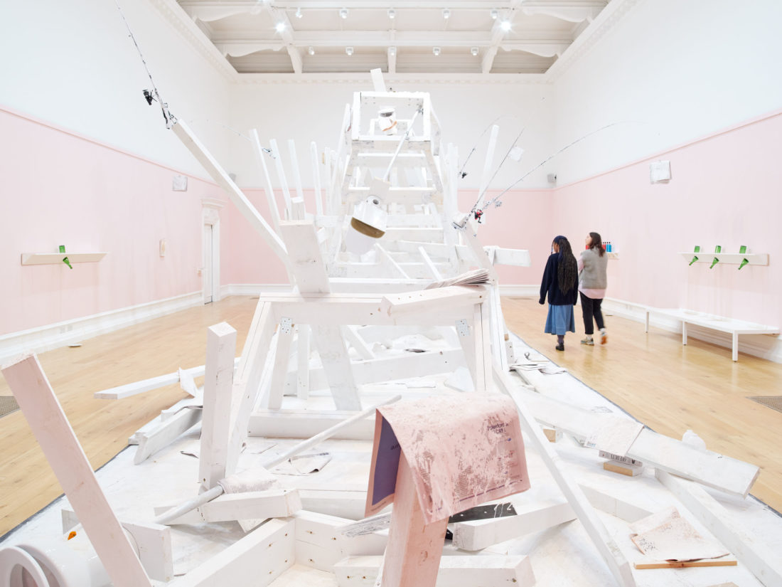
Pope.L: Hospital, South London Gallery, 2023. Photo: Andy Stagg. Courtesy of the Artist.
1. Creaking and crumbling sounds
Walk into the Main Gallery and see three huge towers in a state of collapse, smothered in white dust, wait a while and in the background you’ll hear a soundtrack to the piece. Accompanying the vast structure in the centre, another iteration of Pope.L’s Eating the Wall Street Journal, are the sounds of crumbling and falling. Dramatic and uncontrollable, the noises replicate what you can see in the gallery – a vast structure falling to its knees.
Pope.L: Hospital, South London Gallery, 2023. Photo: Andy Stagg. Courtesy of the Artist.
2. Hidden flowers
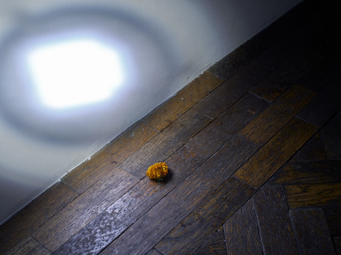
In the entrance to the Fire Station, dried marigolds are scattered on the floor. Petals make their way up the stairs, carried on the soles of visitors’ shoes. These sunshine marigolds pop up elsewhere too, on a toilet in the Main Gallery as part of Eating the Wall Street Journal (Mother Version), 2023, and hidden around the galleries.
The hidden marigolds sit quietly in the background, a reminder of the connection between life and death. Placed in unexpected corners, they are also symbols of defence, in many cultures they are believed to play a part in warding off evil spirits.
Pope.L: Hospital, South London Gallery, 2023. Photo: Andy Stagg. Courtesy of the Artist.
3. Buckfast bottles
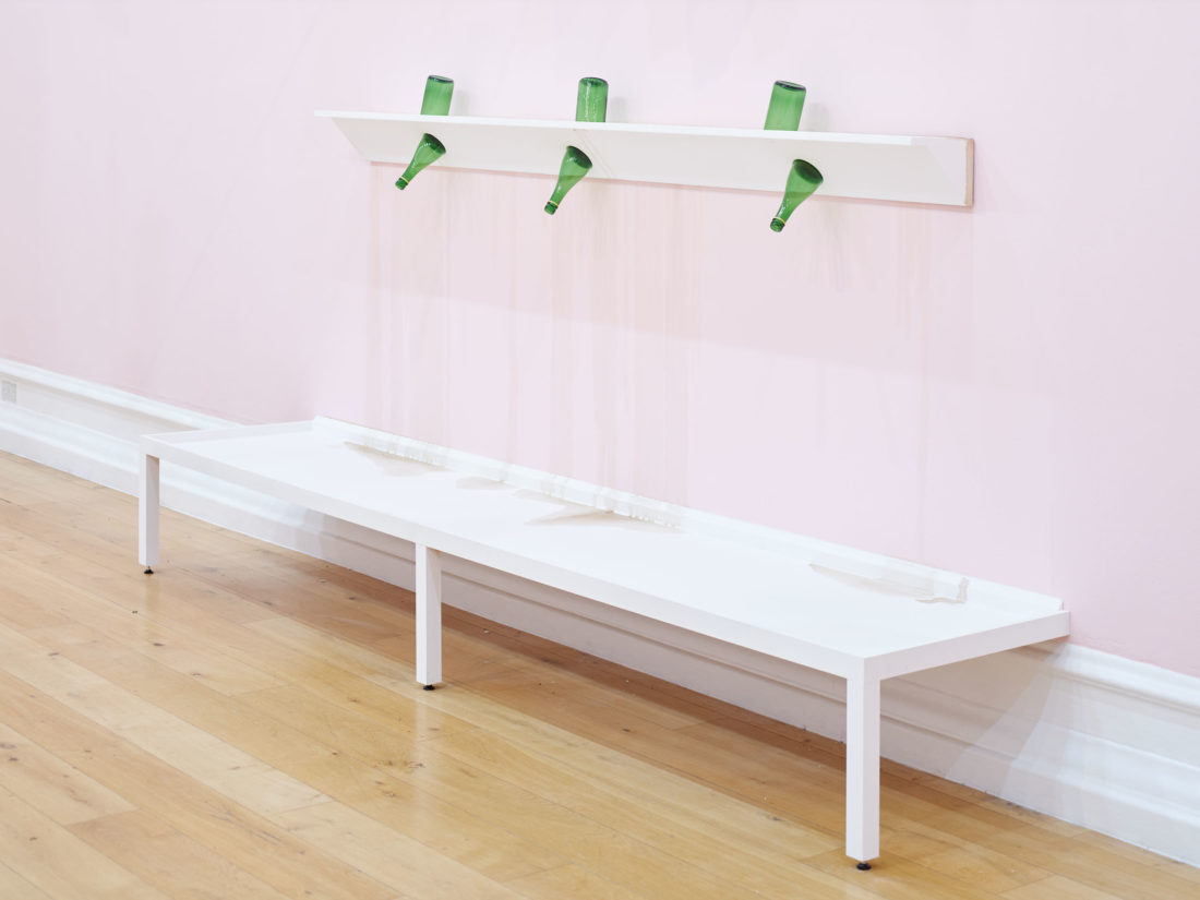
In both the Main Gallery and over in the Fire Station there are different versions of what Pope.L calls ‘shelf works’. The dark red, sticky liquid dripping out of them, and pooling in plates on the floor, is Buckfast!
Buckfast is a tonic wine, a cheap alcoholic drink, made by monks in Devon. The artist was specifically interested in it because of its reputation for being marketed to young people. Buckfast bottles sit alongside Cactus Jacks bottles, a popular drink amongst young people in the US. The pouring liquid has been mixed with disinfectant, giving the room a heavy stench of alcohol, somewhere between the sterilising and the drinkable.
Pope.L: Hospital, South London Gallery, 2023. Photo: Andy Stagg. Courtesy of the Artist.
4. Reversed canvasses
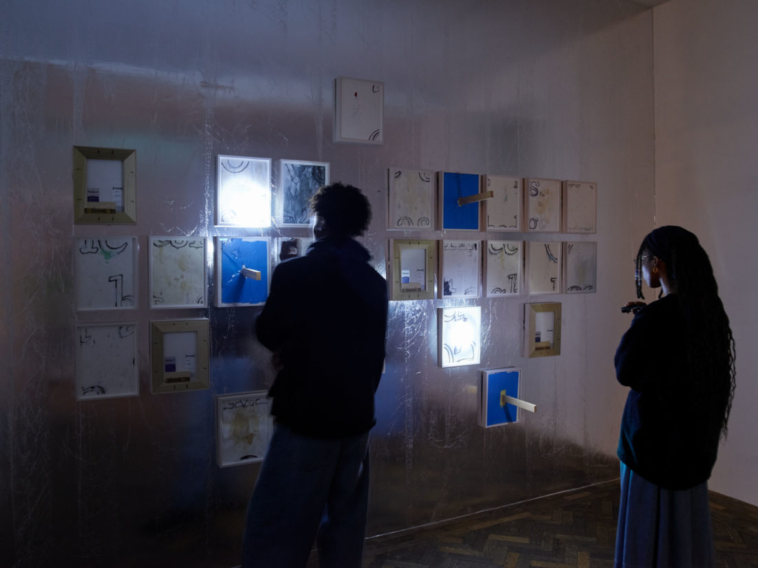
Displayed in a grid in the Fire Station are Pope.L’s Space Between the Letter Drawings (SLG Version), 2013. In total there are 26 drawings, but you might have spotted that some are missing from their frames. These works have been placed in other parts of the exhibition, allowing you to piece together the puzzle of the missing grid.
Pope.L: Hospital, South London Gallery, 2023. Photo: Andy Stagg. Courtesy of the Artist.
5. Banners
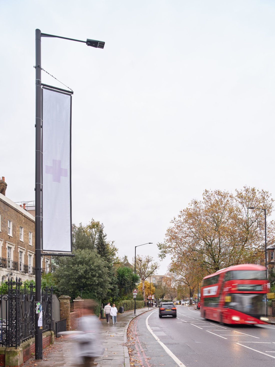
Outside the buildings, our normal South London Gallery banners have been replaced. No longer bright blue, Pope.L has transformed the flagpoles with white sheets emblazoned with a very pale pink cross. A sign that you’re in the right place for an exhibition titled Hospital, the cross in the centre of the banners is difficult to see – not the ‘Red Cross’, but instead, as Pope.L himself said, a cross that is “too pale to be red”.